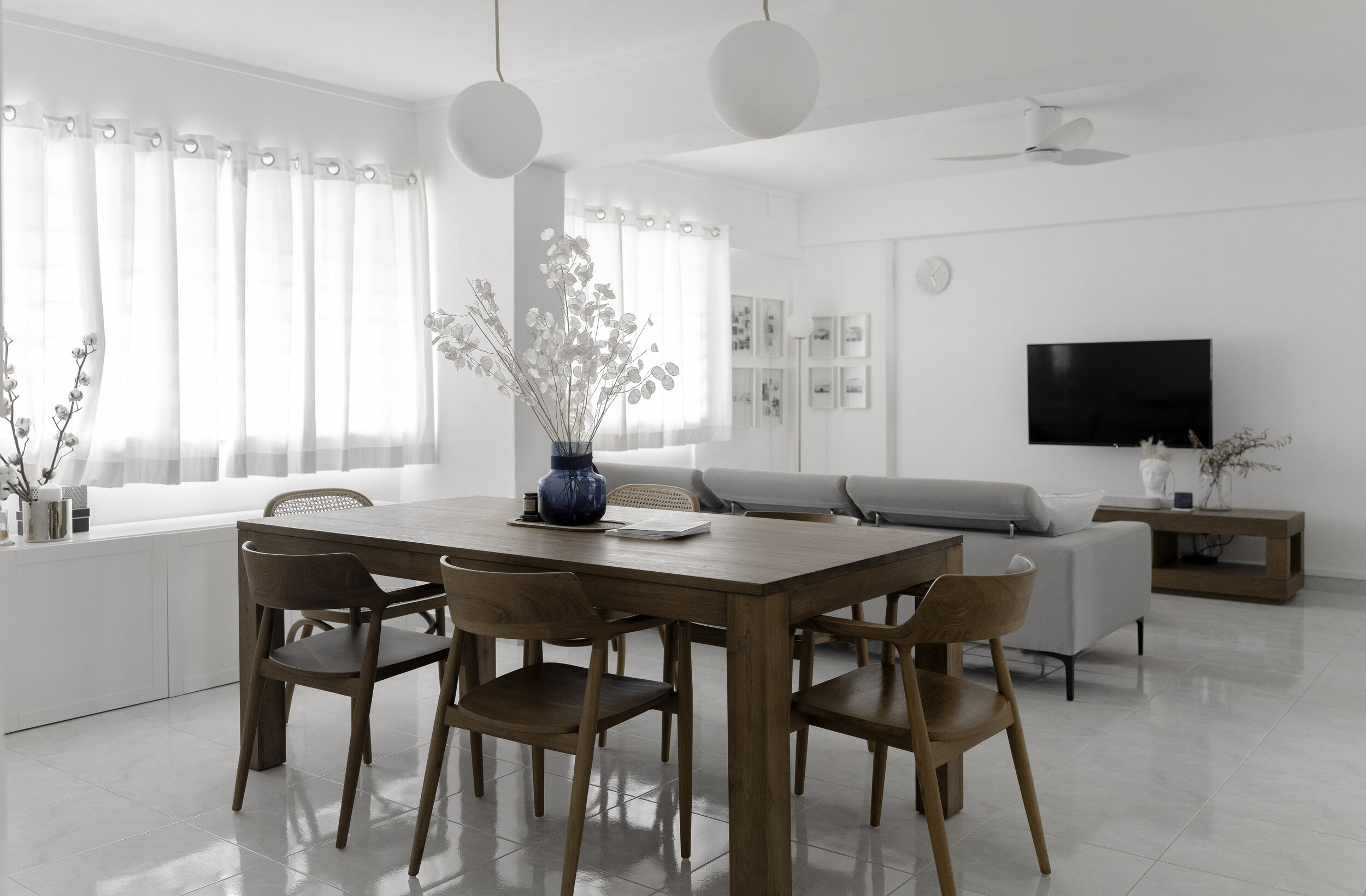
For our clients working in corporate communications and engineering, they had a simple brief to create a bright and airy home that can provide them respite after a hectic work day. Read further to find out how our Far x Far team transformed this gaudy pink resale flat into a modern white and blue home!
The site
The original layout had a generous living / dining space and rooms that opened out to the area. To have more privacy in the master bedroom, the original door was sealed up and accessed from the adjacent bedroom, which was transformed into a walk-in wardrobe. The previously walled-up kitchen was also hacked to bring in more light and visual connectivity through the house.
Blues for a gender neutral palette
The couple originally preferred to have a mixture of blues and pinks, but eventually settled for more blues to be gender friendly for their future family.
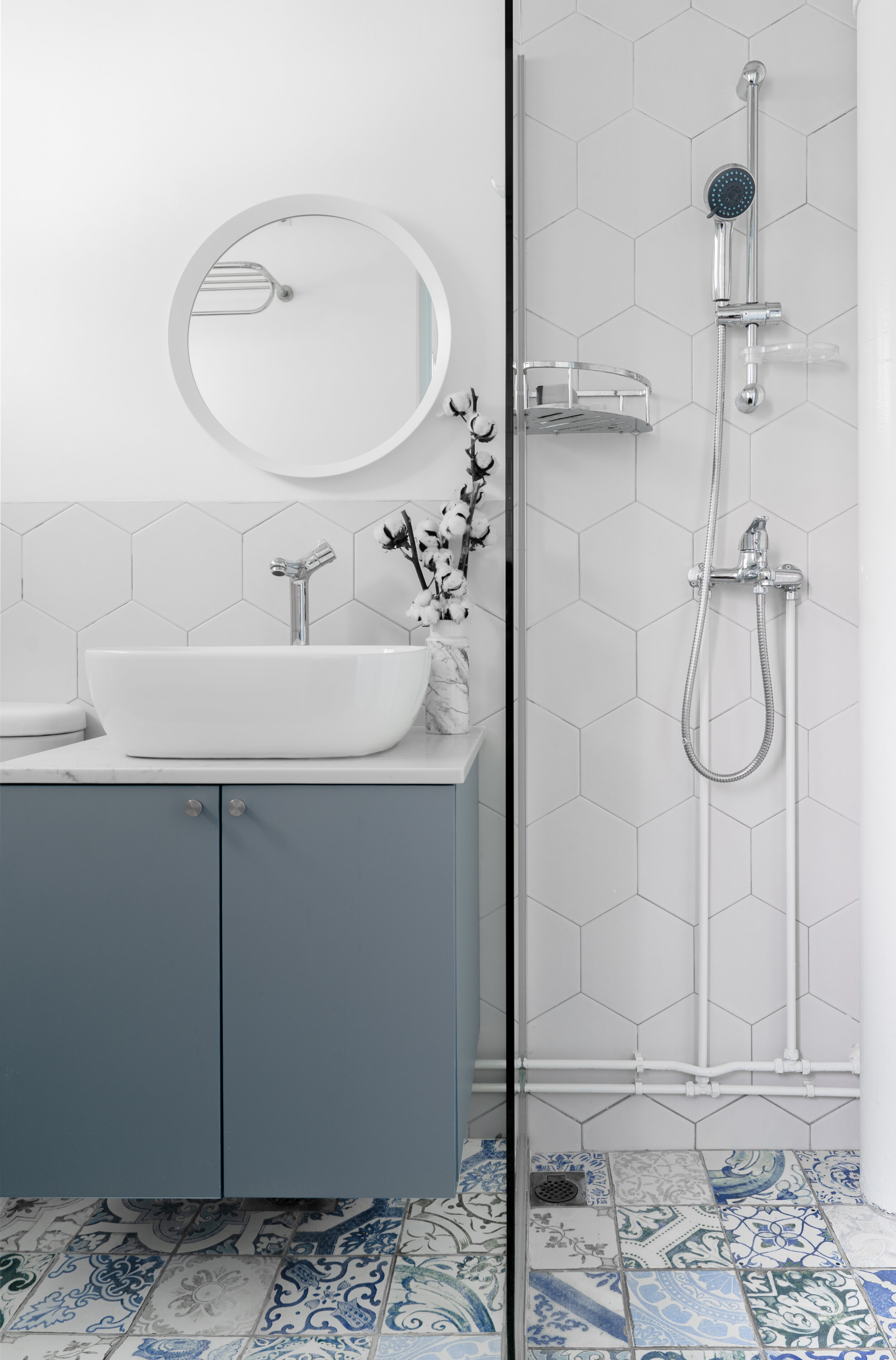
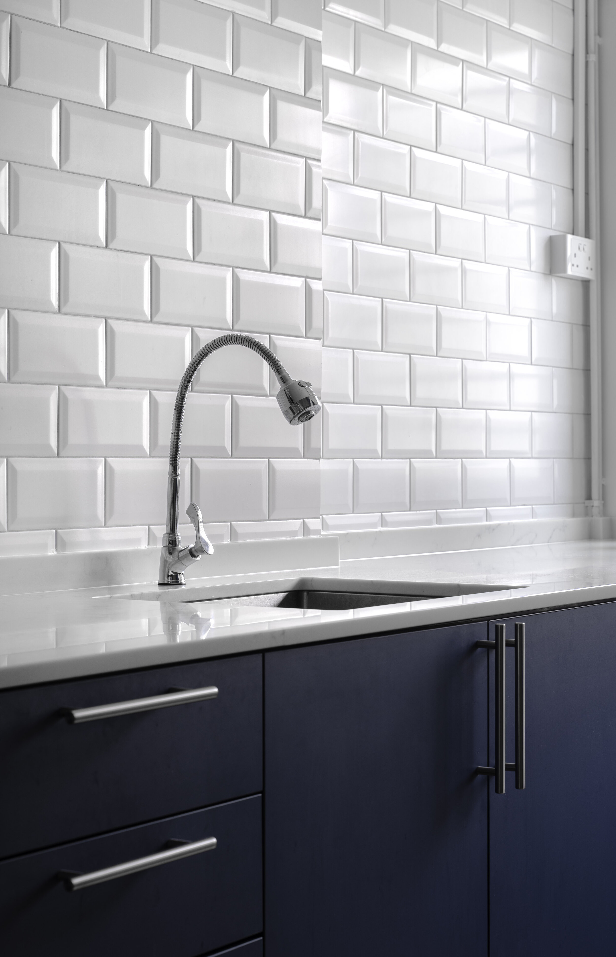
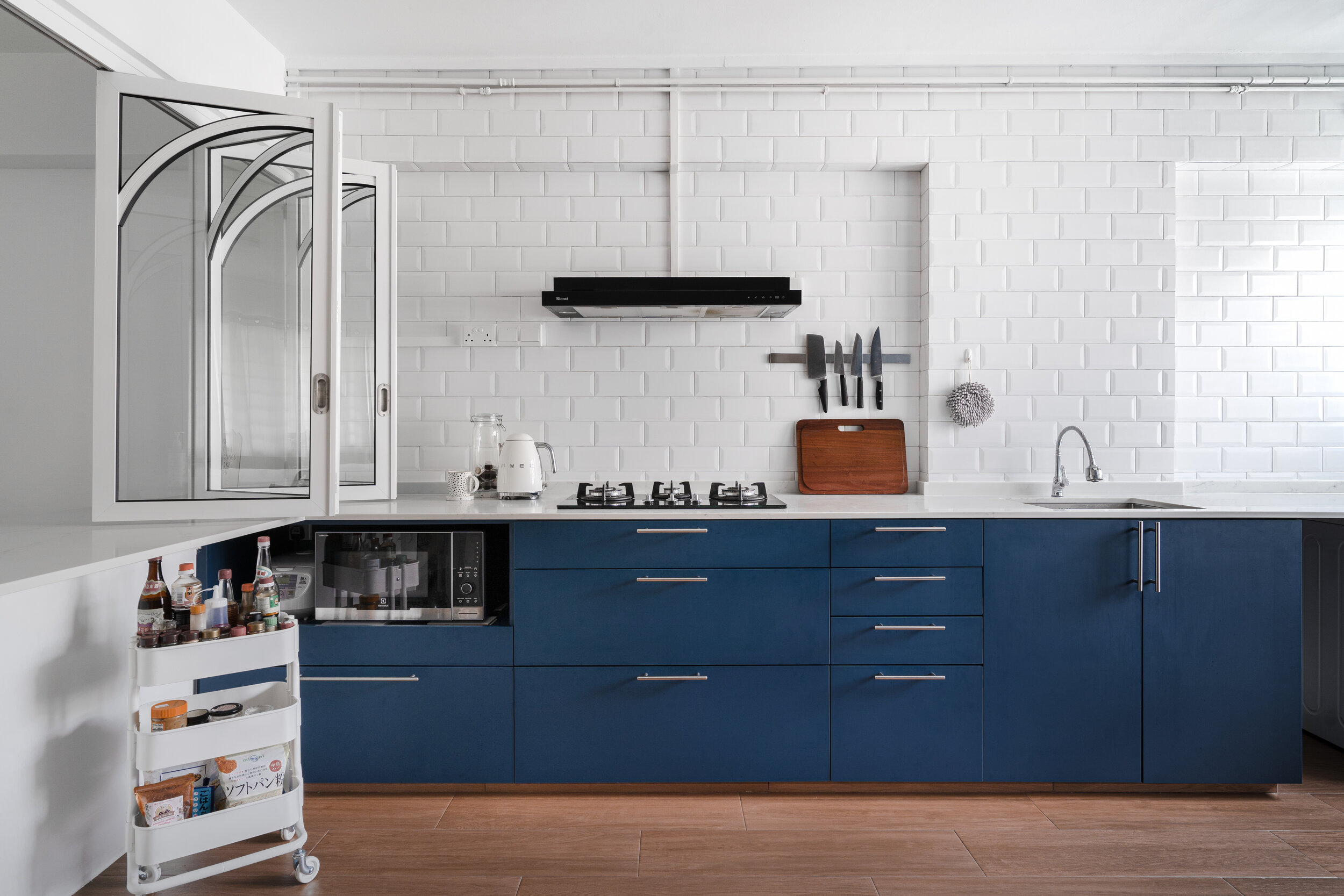
Different shades of blue fill out each room according to their functions; a light, periwinkle in the master bedroom, a royal navy blue for the kitchen cabinets and a mixture of blue patterned floor tiles for the bathroom.
A dynamic kitchen
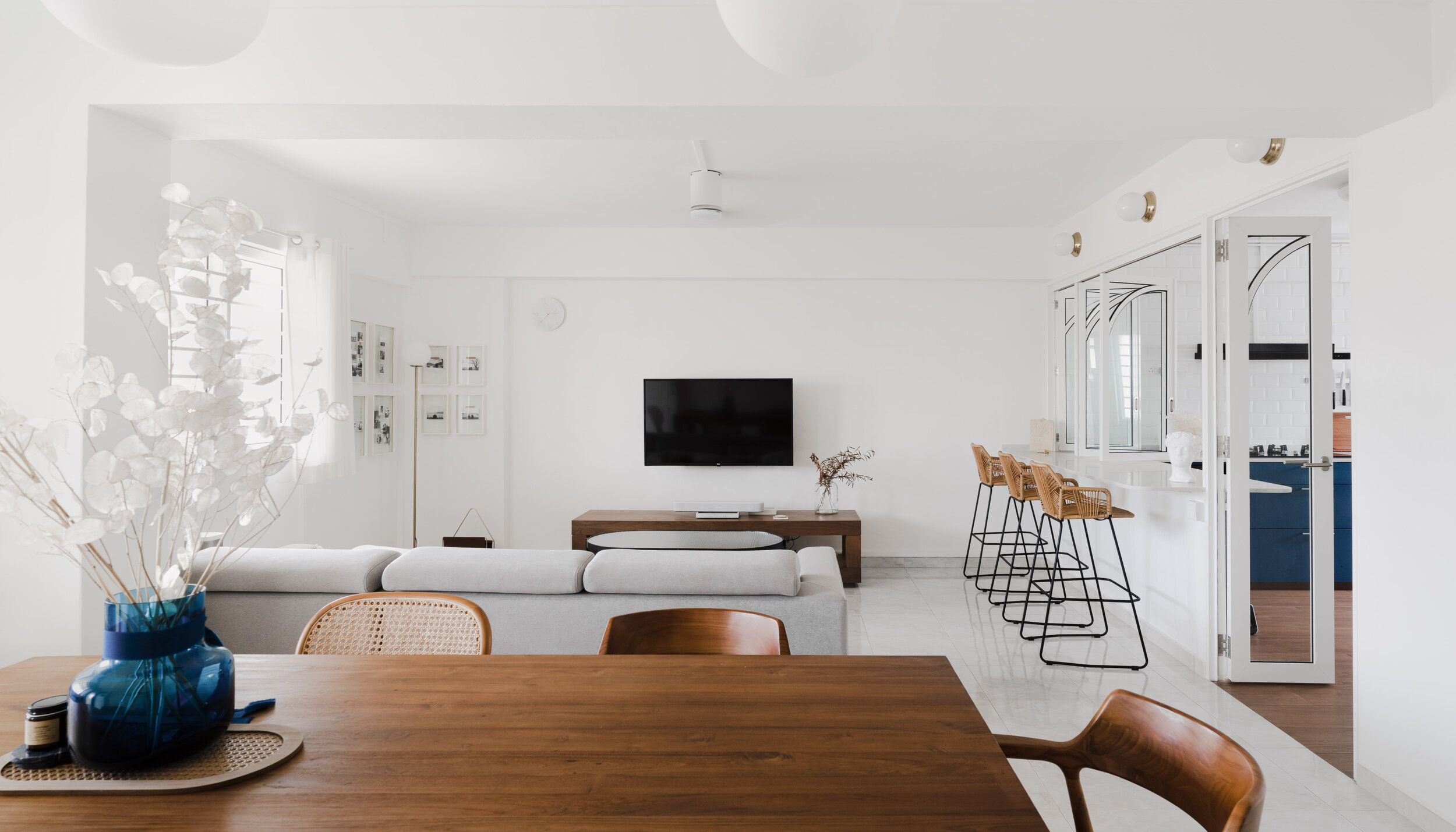
Upon stepping into the house, one would be first drawn to the bold arched window frames of the kitchen with contrasting black trims. As the couple cook often, they prefer to have a kitchen with operable doors to keep the fumes in.
With the windows closed, the peninsula counter is transformed into a bar ledge on the living room side, and a worktop on the kitchen side with a spacious storage below for additional trolleys. Finished off with rounded corners and a heavy duty pull-out oven shelf, this kitchen is highly versatile with safety in mind.
A grand walk-in wardrobe
Right in the spare bedroom we have an L-shaped, full height wardrobe, designed with rattan doors to allow for ventilation. From the start, the couple was happy to share their need for ample clothing storage, which we were able to create in this 7m long wardrobe. Each door slides open to reveal a full section for easy access, while custom corner drawers help to eliminate wasted space.
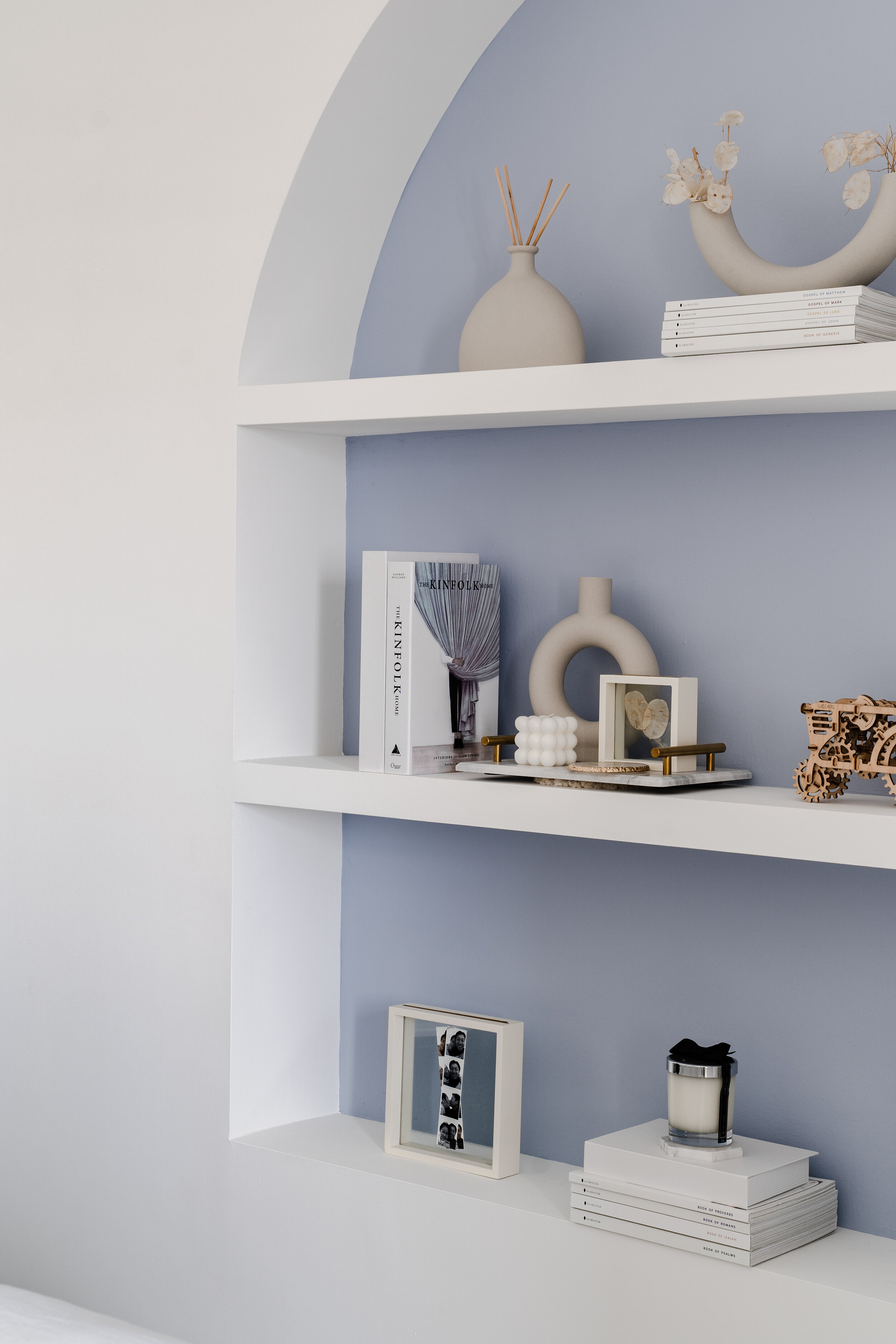
On the opposite wall with complementary arch elements, we built shelves to house the couple’s collection of decor and memories. The sliding bedroom door opens up to further widen the space, all while maintaining a level of privacy for the sleeping area.
Bathrooms
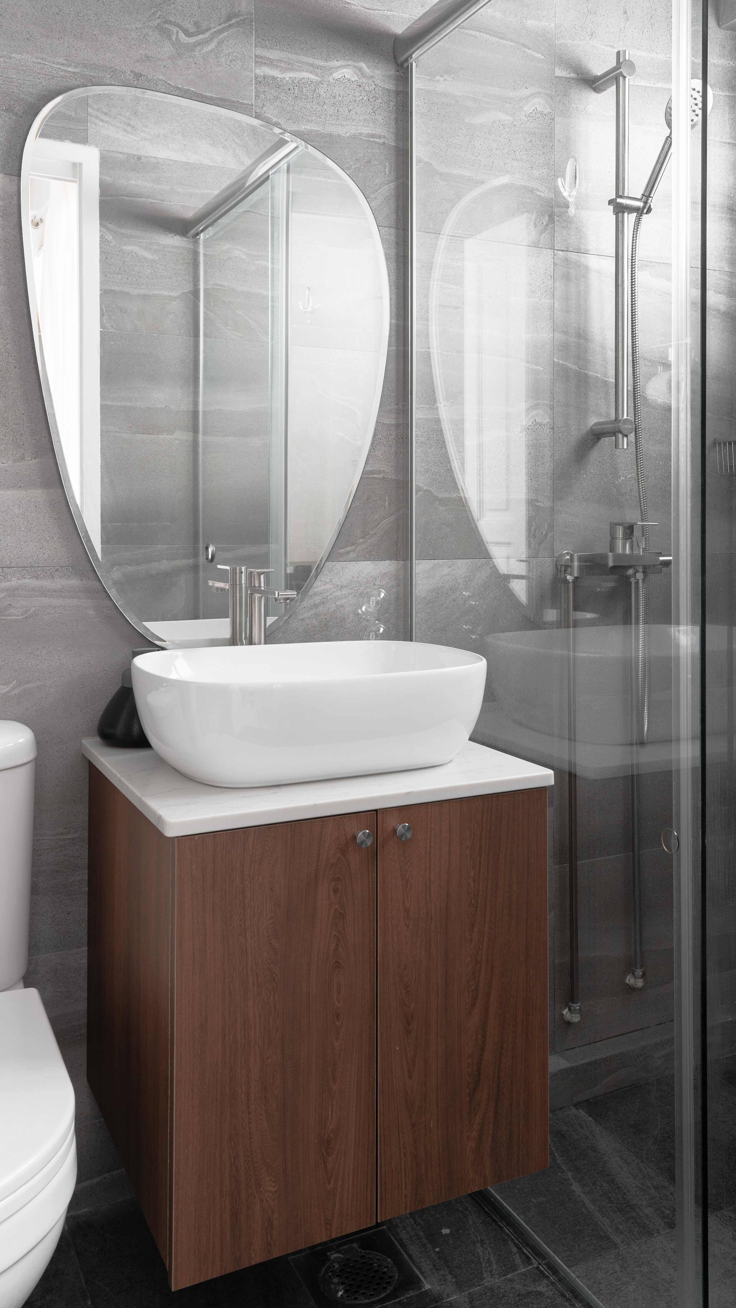
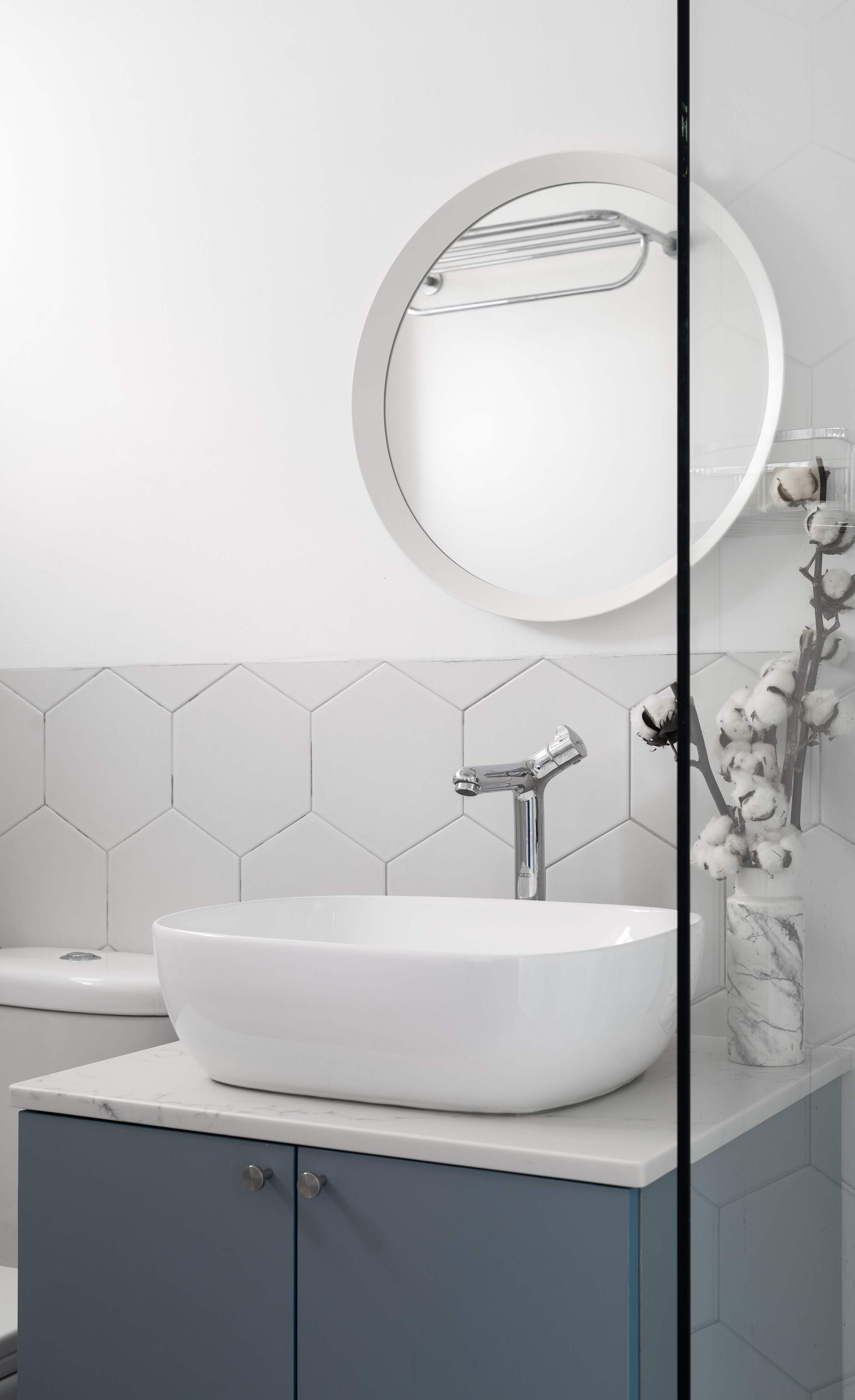
The common bathroom kept to the overall blue palette with the use of geometric floor tiles and dusty blue laminates, while a darker palette was chosen for the master bathroom. The result is a hotel-like feel, with dark grey tiles and dark wood to relax the mind and unwind in peace.
With some final touches of velvet furniture and plush cushions, this house is transformed into a cosy abode and we can’t wait to see how it will change with time to come.
Check out the full gallery below, shot by Studio Mahogany


