A MID-CENTURY MODERN HOME WITH UNIQUE HEIRLOOM FURNITURE
Type: HDB BTO 5 Room | Location: Bedok, Singapore | Home to: 2 Adults
Designer: Soh Hui Ling | Project Manager: Marcus Chia, Keith Goh
Enter this open-concept home designed primarily around unique pieces of furniture that were passed down through generations. From a vintage sewing table converted to a vanity table, to an antique wood framed mirror, this 5 room BTO is filled with countless memories from the couple's multicultural background.
Layout
Like many young couples, our clients would want their home to be ideal for hosting their friends and guests. A key requirement was to have the living area open and spacious to organise large gatherings. The main layout changes were the open concept kitchen with an island counter, and knocking down of the wall between the master and bedroom 1 to create a walk-in wardrobe.
Credits: Caesarstone | Studio Gabriel Garbin | Lynden Foss
Concept References
Being in the creative industry, our clients had many artworks and photographs that they wish to display in their home, along with a vast collection of ceramic wares. The material palette was thus kept to simple white walls and wood tones, to keep the focus on their home decor and provide a clean canvas for their future furnishing to grow into.
Colours and Furniture
Our clients wanted to add elements and colors that they love into the space, which consist of dark wood, white, black, and dark forest green. The furniture passed down from the wife’s mother are quite unique and speak a lot of their personality, such as the bamboo cupboard in the bedroom and the antique wood framed mirror.
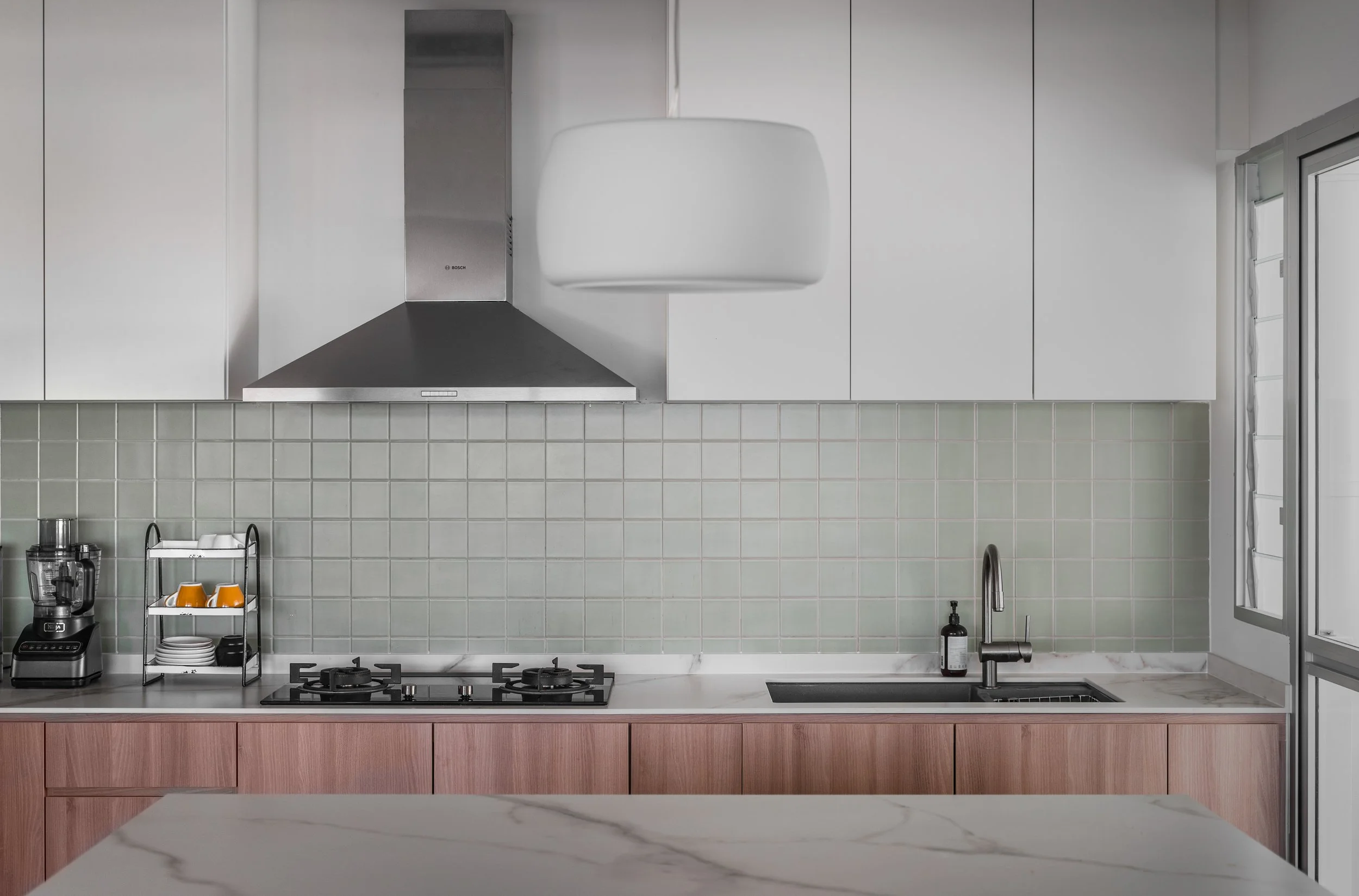
Small accent colours were also added to provide subtle areas of interest, such as the pastel green backsplash in the kitchen and in the bathroom. The final design is a very clean home focused on loose furnishing, with lots of storage and potential for future growth.
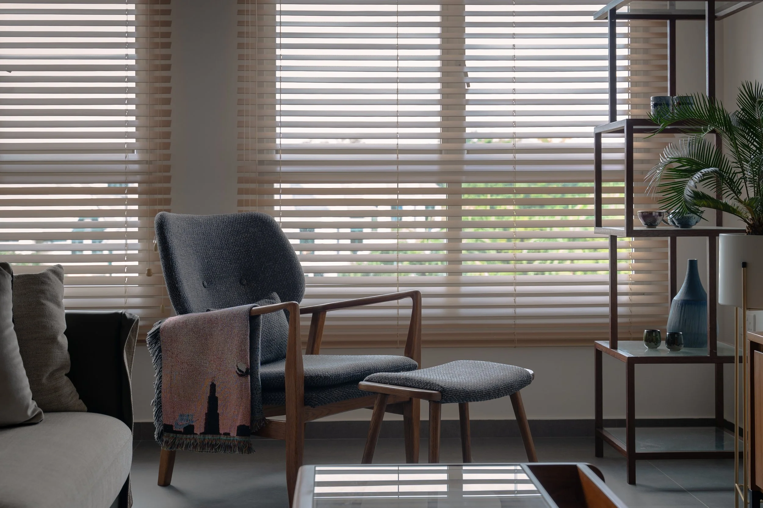
Left: Standing display shelf from a stationery store that was closing down | Right: Rosewood and striped glass display cabinet from Noden
Living and Dining Area
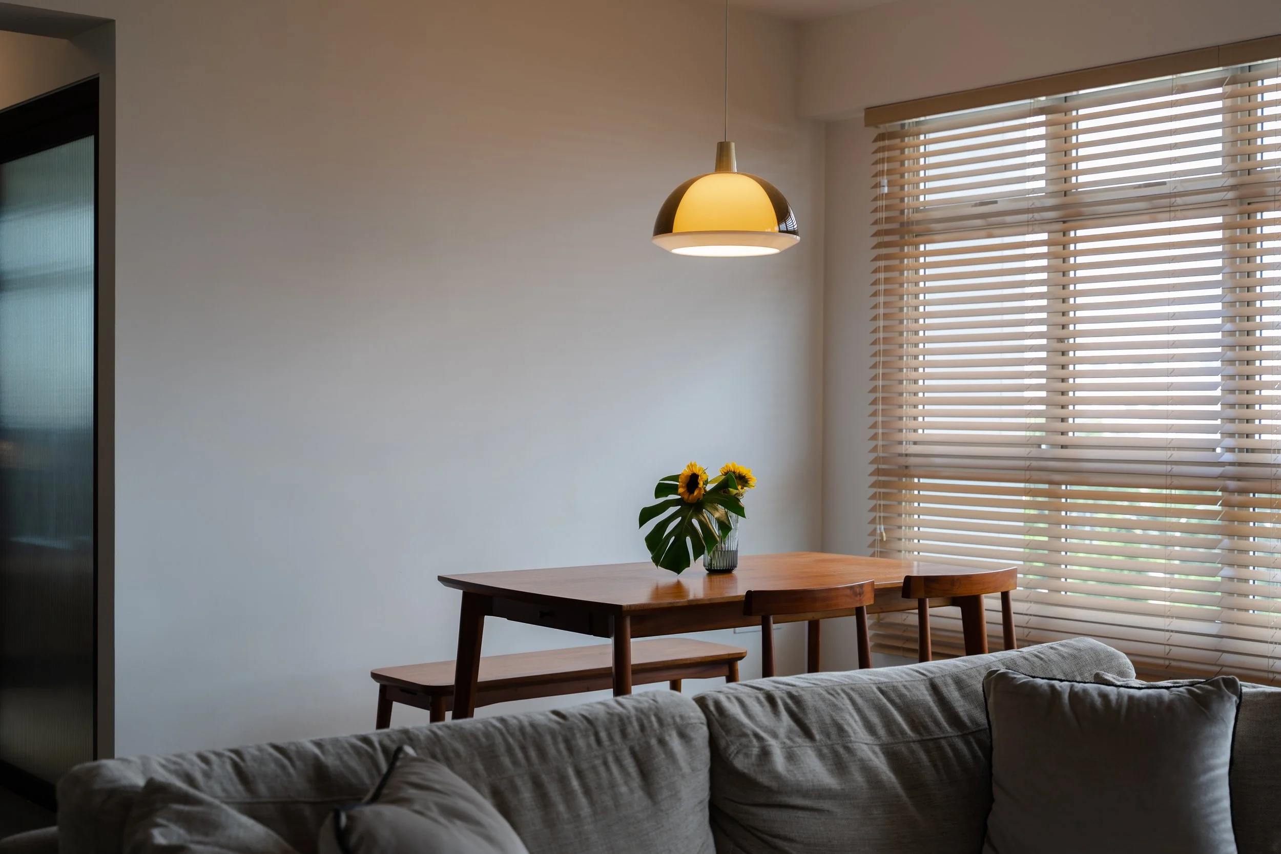
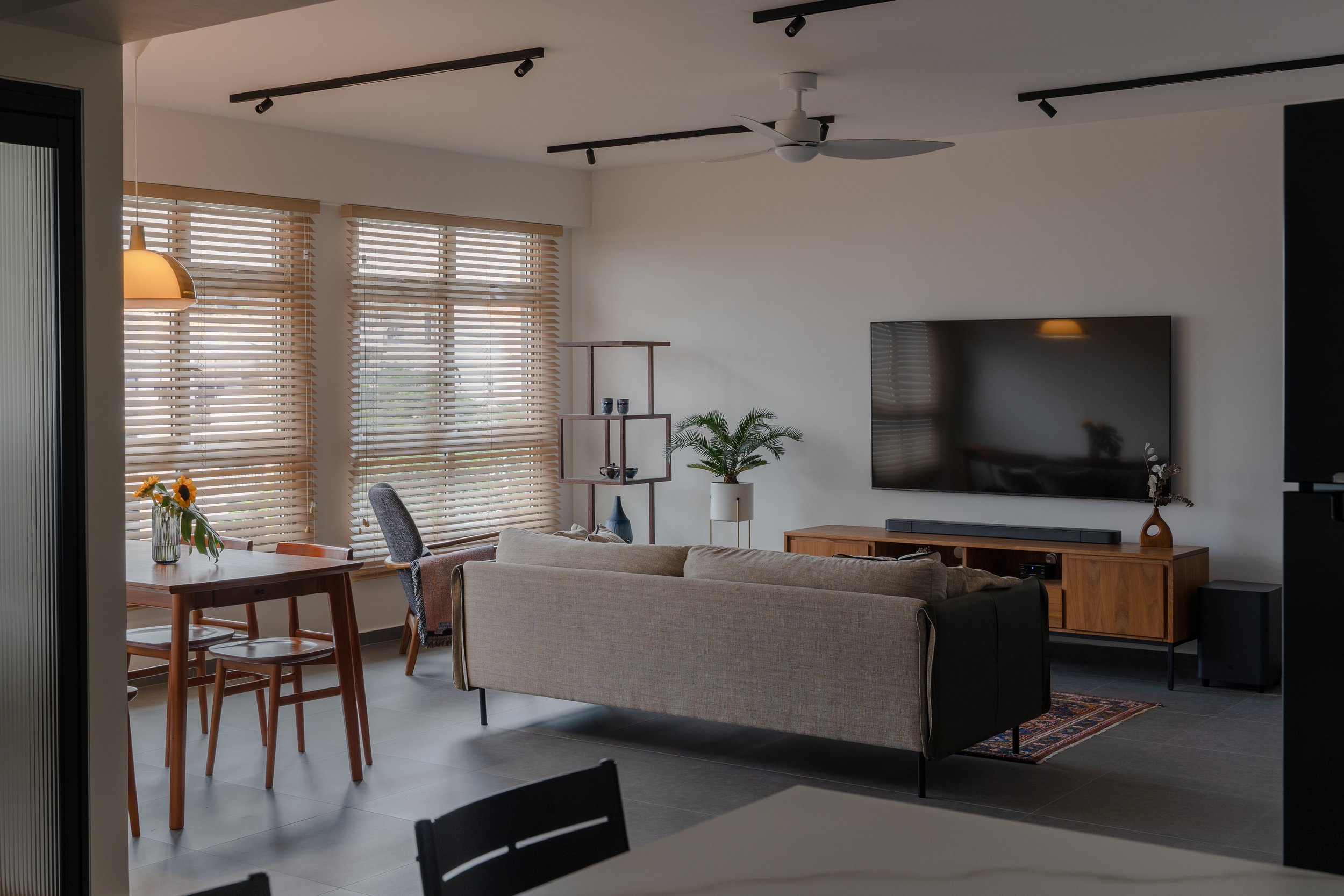
The living area is furnished with warm-toned wood pieces that have a combination of grey linen, glass and slim metal profiles. With no key feature walls or dramatic textures, the mid-century modern style furniture can speak for themselves.
Carpet inherited from the wife’s family home
Mood lighting is a key concern especially in a space with many bare walls like this, and it certainly helps to have a combination of track lights and spotlights to bring out the different experiences of the space. The lights sourced from our client’s contact ( Light + Form Concepts) could be surface mounted without the use of a false ceiling, and they came in interchangeable attachments which allows for more flexibility in lighting design.
Despite our client’s initial dislike for spotlights that protrude from the ceiling, we went ahead with them eventually to highlight display areas, add softness to a long wall and to carve out cosy corners in the room.
Kitchen
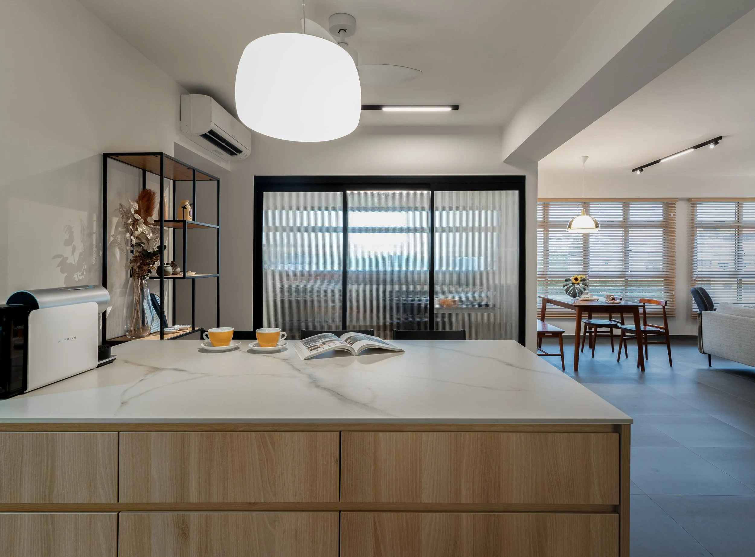
Originally conceptualised as an open and airy kitchen with display ledges at the top, designer Hui Ling added more top cabinets after the couple’s consideration for future storage requirements. The overall look of the kitchen is bright thanks to the white surfaces and light wood, with minimalist finger grooves for the cabinet doors in place of handles.
Being coffee lovers, having a wide island counter dedicated for breakfast and coffee is a huge plus point with the extra prep area and storage below. Because the ambience is so cosy under the pendant lights, the couple find themselves actually spending more time eating there as compared to the dining table.
Home office
The original bedroom 2 has been converted into a home office, fitted with glass sliding doors with reeded panels. The glass allows for more light to illuminate the kitchen better even as the doors are closed during work calls and studio recordings.
Working from home is flexible with the availability of space around - our clients sometimes take turns to work at the dining table and island counter if one of them has to be isolated in the home office.
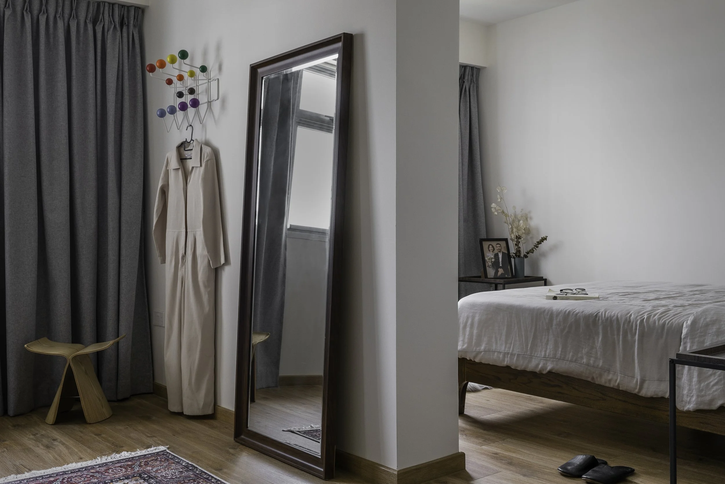
Vitra Hang-It-All
Master Bedroom and Walk-in Wardrobe
To create a walk-in wardrobe, the master bedroom has been merged with the adjacent bedroom by knocking down the shared wall and sealing up the original door.
The family’s old vintage Singer sewing machine is fitted with a marble table top and used as a vanity table
Hui Ling proposed this layout so that the wardrobe is closer to the ensuite bathroom, which enhances the experience of dressing up right after showering. Our clients have also styled the simple wardrobe space with a bamboo ladder to hang their towels, and a large rug that complements the antique full length mirror.
Having the bed in the smaller room also made it feel cosier and encouraged better rest, with the bedroom door out of sight.
Browse the full gallery below
Photography by Studio Mahogany


