This project is a BTO renovation of a creative couple - the Mrs was an editor of an interior design magazine while the Mr works in the media production industry. Our clients came to us with a specific colour palette in mind - Jotun’s Rhythm of Life catalogue. They wished for a home with soothing colours, no stark white walls, and something different from their previous navy blue home.
Floor Plan
Being avid cooks, the couple hoped to have more focus on the kitchen and dining spaces, opting for a simpler living space.
The only hacking works required was between the master and second bedroom, which was done to accommodate the wardrobe in the former.
Not your typical bright and airy look
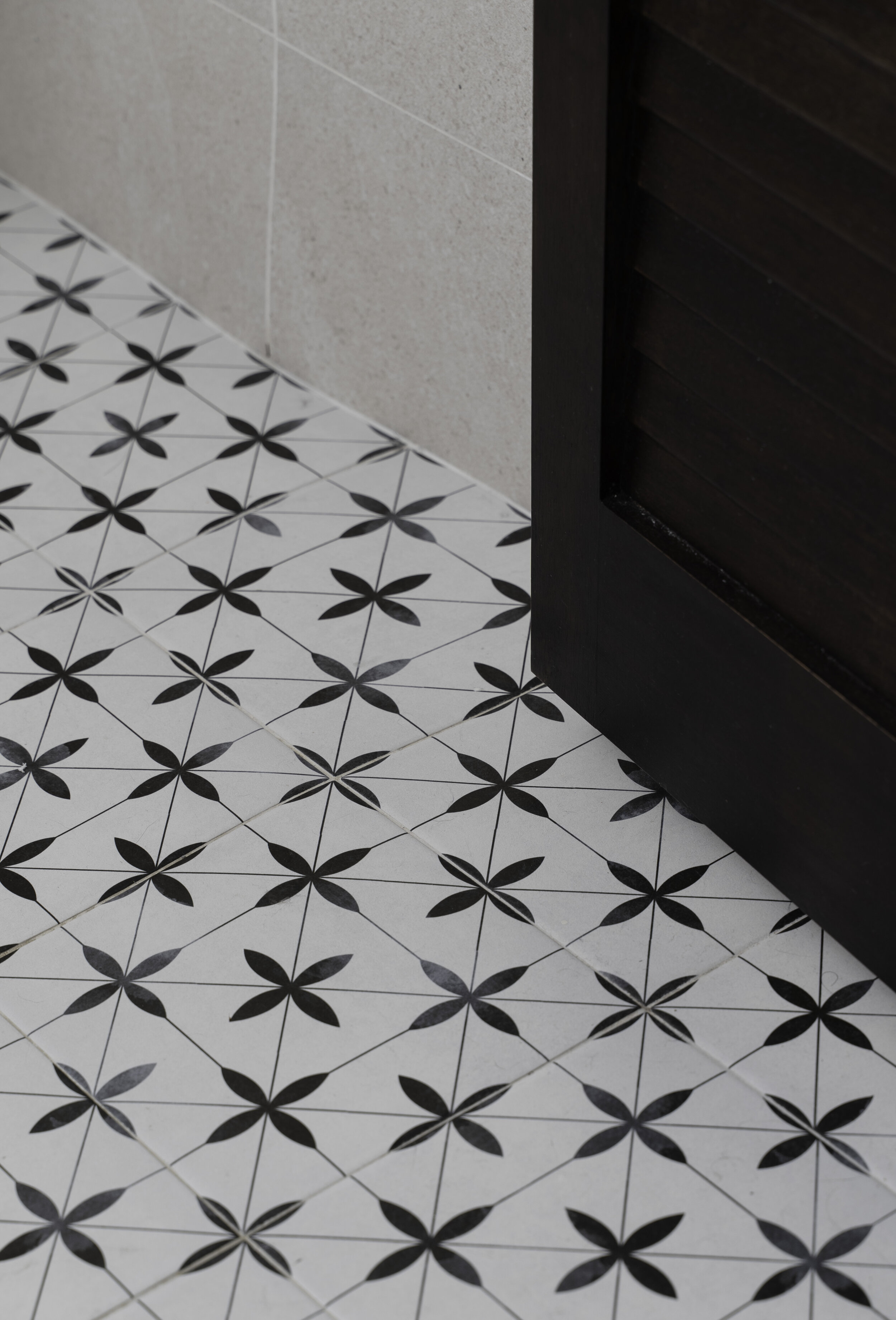
With our clients’ preference in mind, we picked up some laminates in warm cherry wood, sage green and dark - almost black - wood. To bring in some peranakan vibes, we chose a geometric pattern tile that is hand-painted for a softer look.
A kitchen built to last
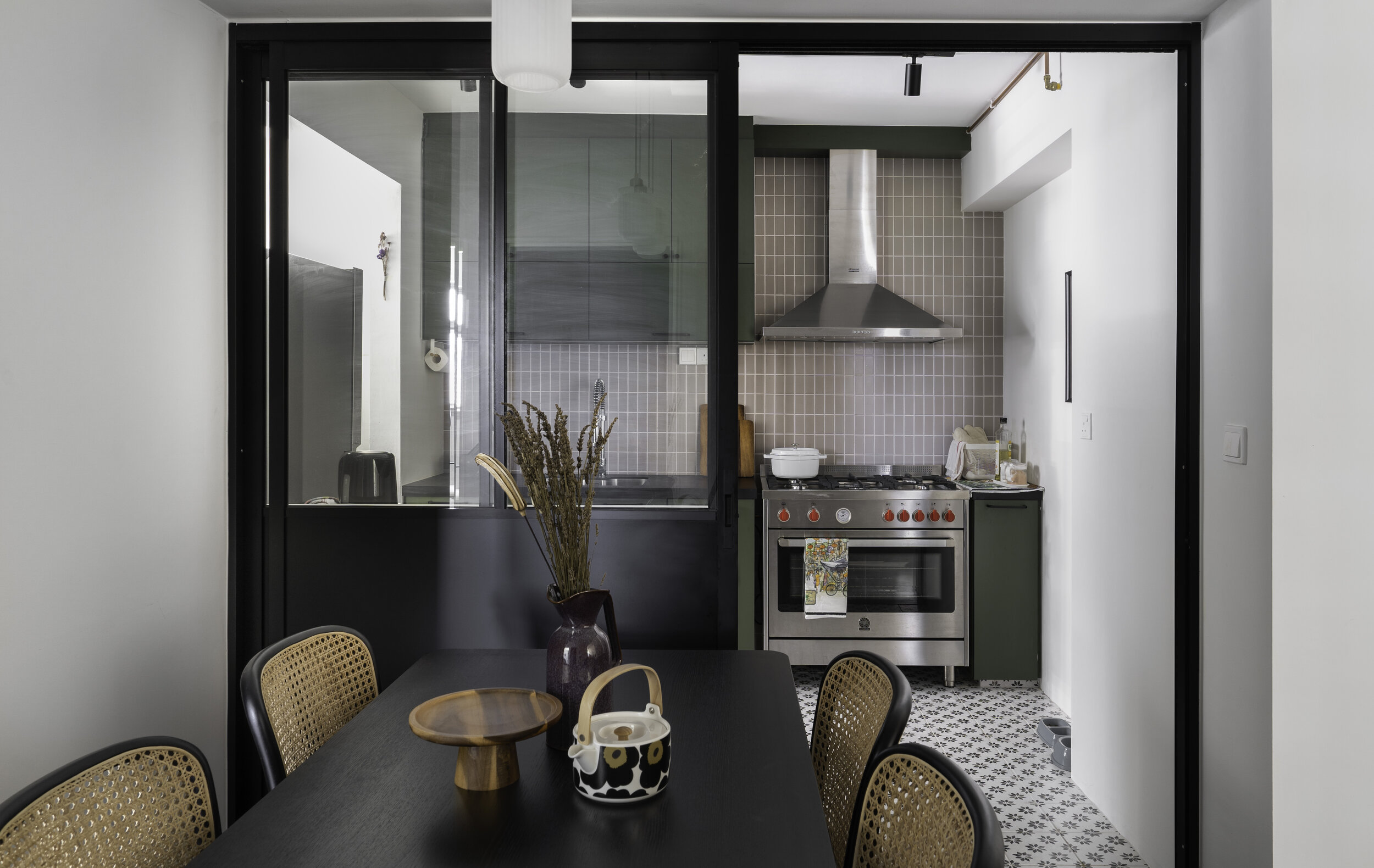
The highlight of the kitchen is the heavy duty standalone stove from La Germania, paired with a huge professional hood. This freestanding stove also comes with a huge oven for cooking in large quantities, perfect for hosting big groups of friends and relatives (pre-Circuit Breaker, of course).
Along with designing for heavy cooking, efficient cleaning was also a key consideration. Double dish racks were placed side by side instead of the typical vertical arrangement for easier reach.
We played with a mixture of handle shapes that are sleek-looking and easy to clean, which matches the black countertop and door frame.
To allow for more counter space, the fridge was placed in the service yard along with the washer and dryer.
With all the heavy cooking, keeping fumes out of the rest of the house is all the more crucial. Black aluminium sliding doors were chosen, with glass windows to maintain visual connectivity to the dining area. The couple kept the furniture simple, going with the same dark wood theme with airy materials like rattan.
Anchoring the space with prints and decor
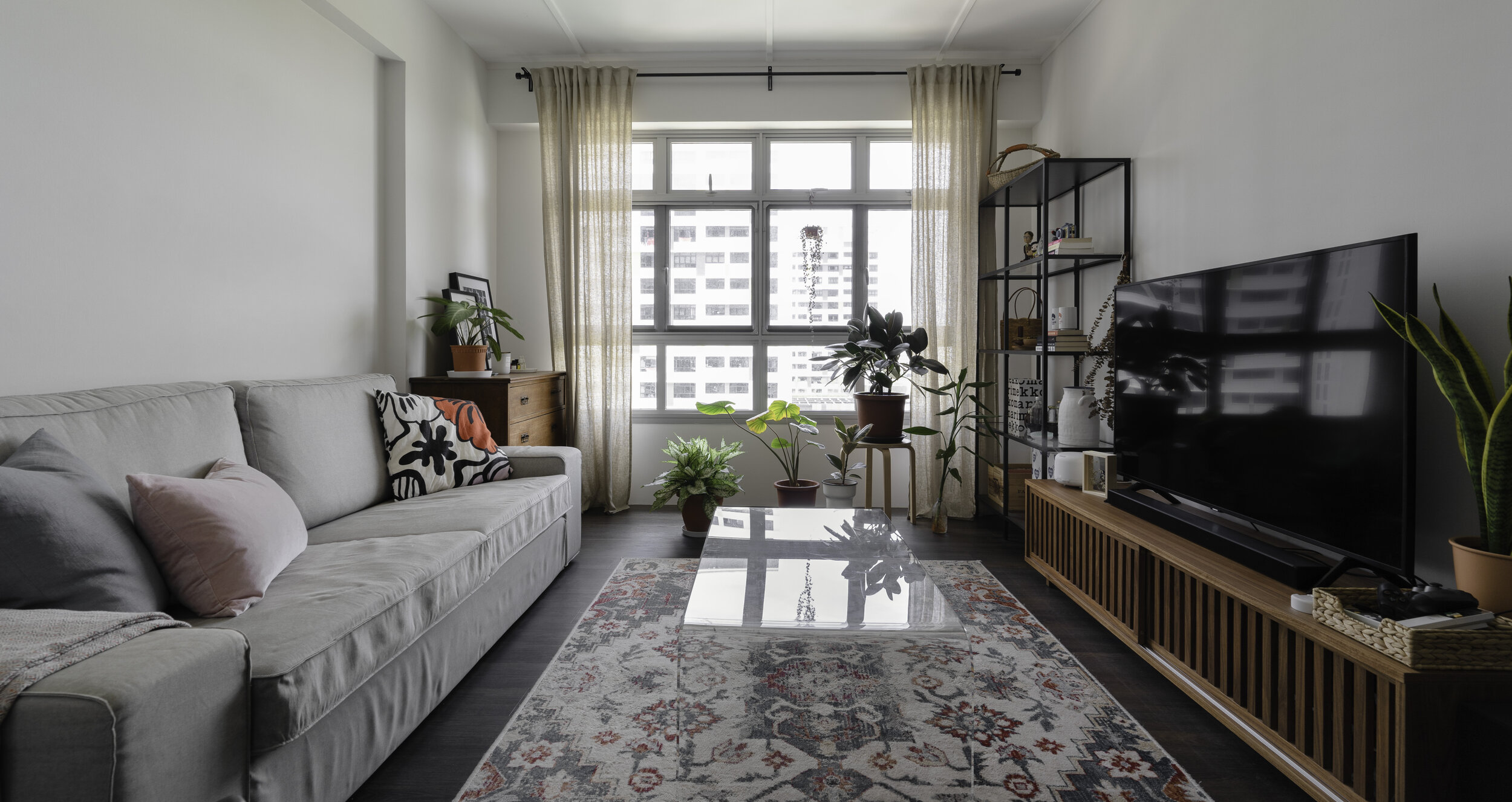
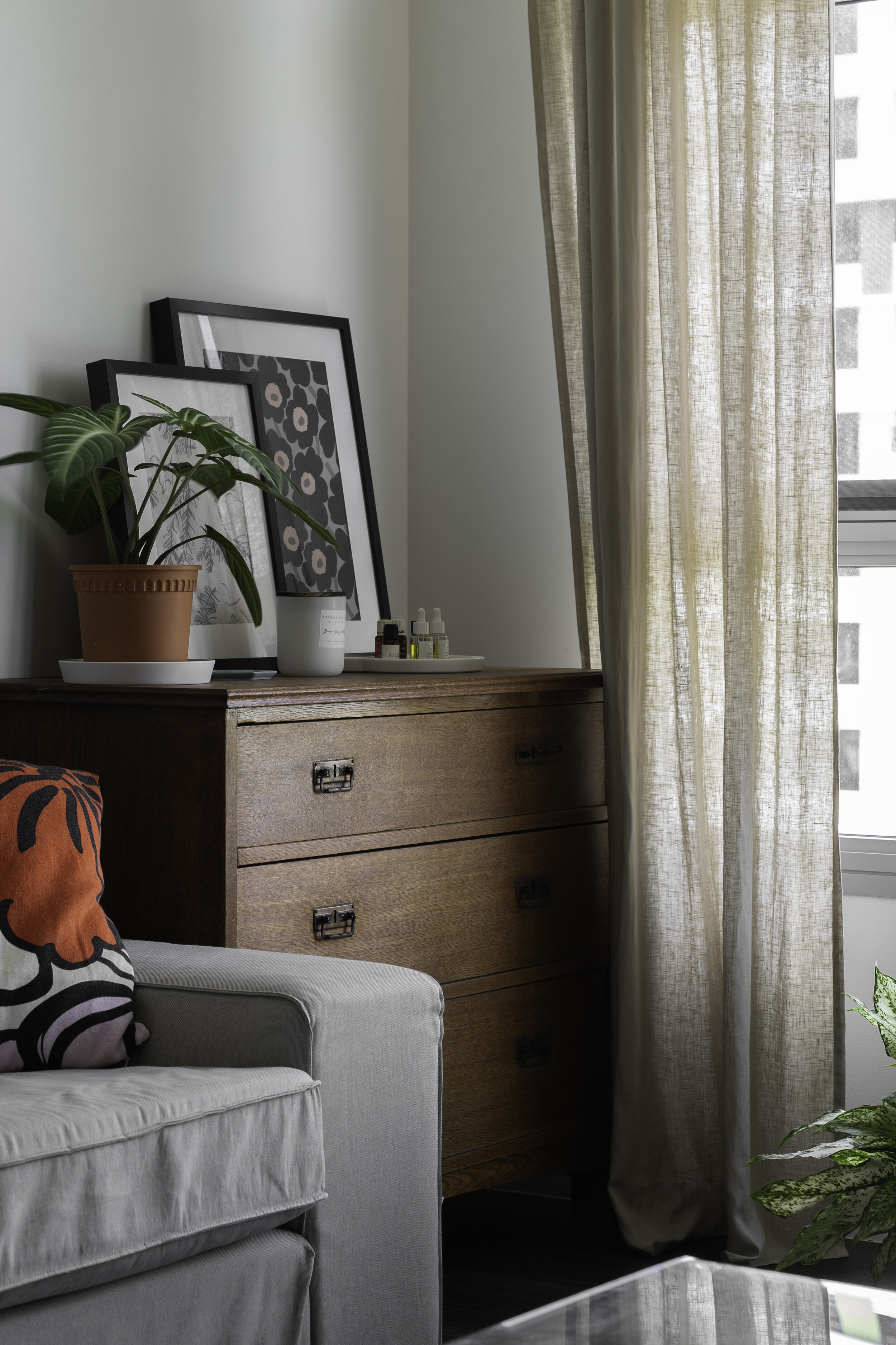
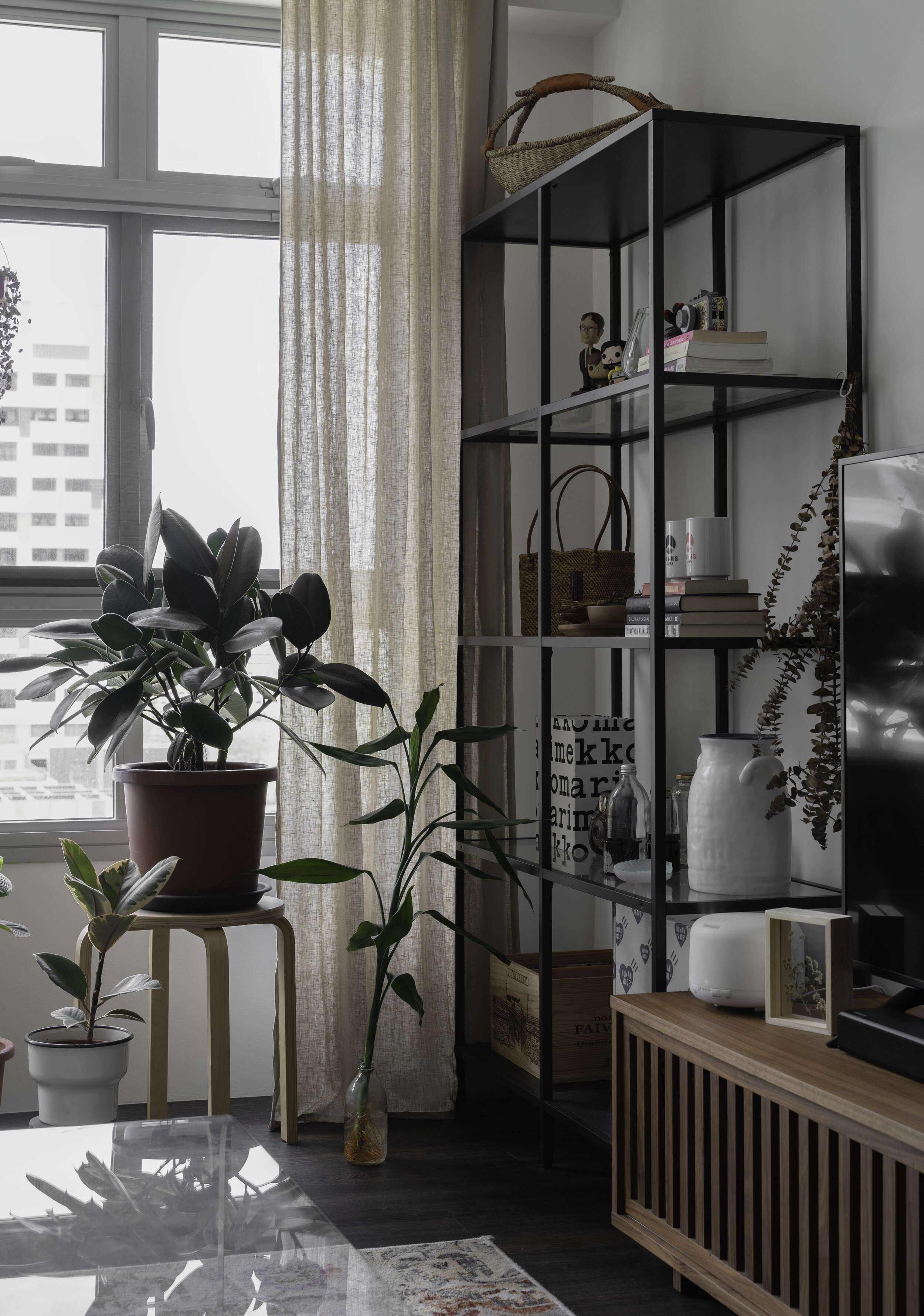
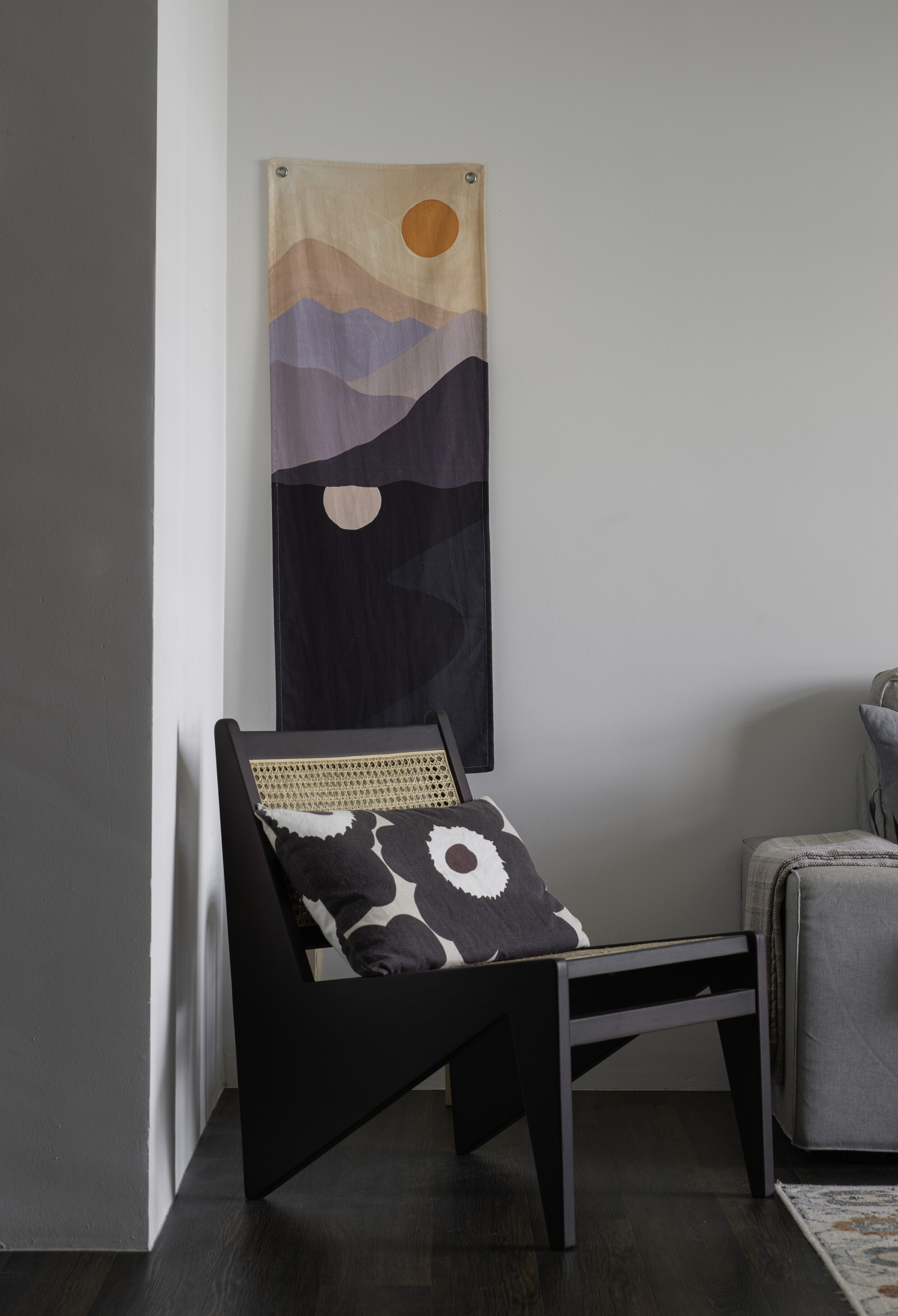
Amidst the mostly dark colours for the interior, the moody vibes were balanced off with a colourful sprinkle of furnishing and art. The blend of textile hangings, intricate rugs and plants help to anchor the loose furniture and create pockets of intimate spaces in the living area.
The full height wardrobe sits flushed against the adjacent wall
The master bedroom followed a darker scheme, with lots of deep walnut for the wardrobe and doors. Unlike the recent trend of converting an entire bedroom into a walk-in wardrobe, the couple preferred to just carve out enough space from the next room for their wardrobe.
Beloved Teddy enjoying the peace of a dark themed bedroom
Bathrooms
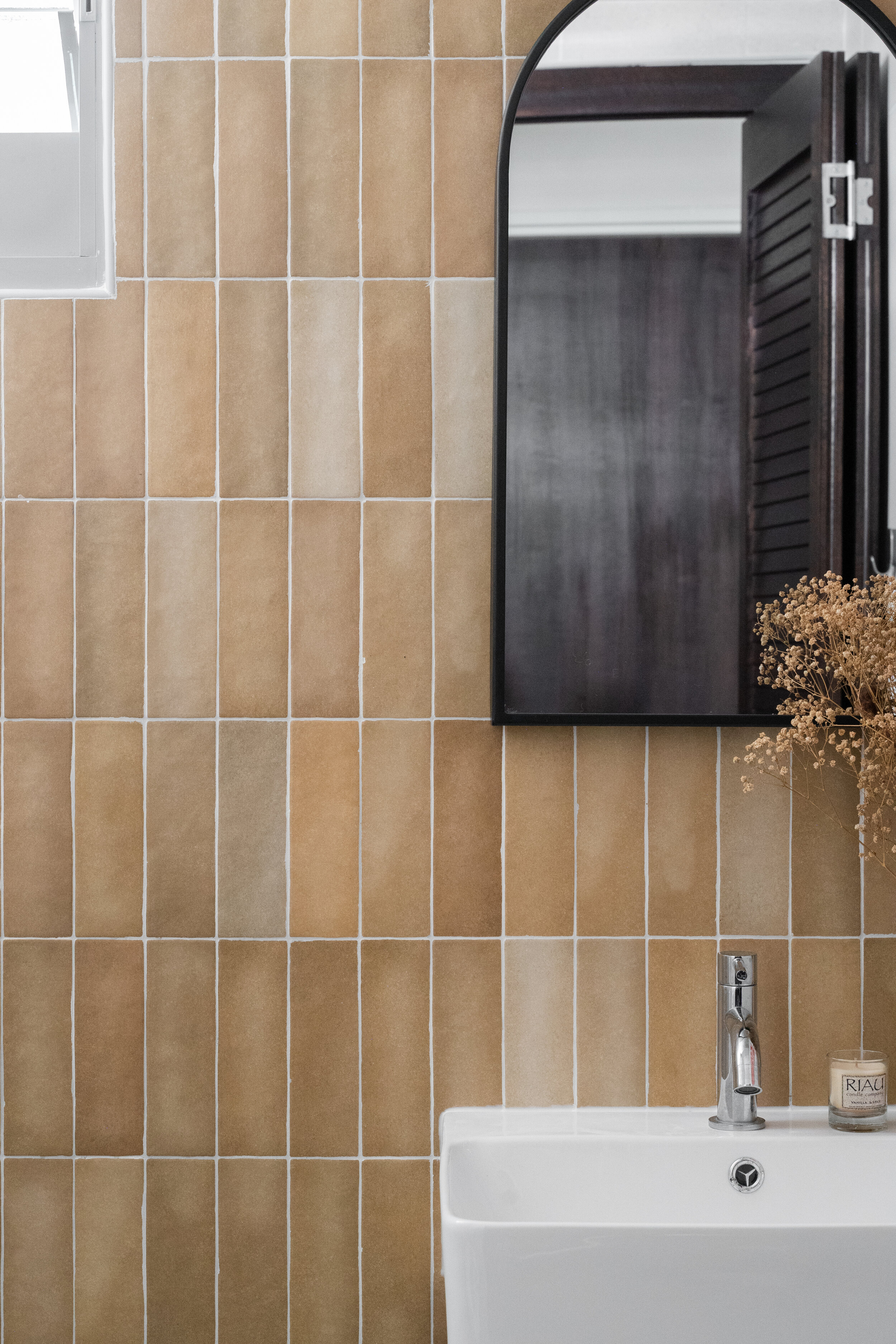
Our original plan was to go with rose coloured tiles for the common bath, but they were unfortunately sold out. We went ahead with mustard tiles of the same series, which went better than expected, with the yellow tones echoing the soft linen and rattan finishes in the other rooms. To allow for more space to bathe their baby, the shower area was designed without a glass screen.
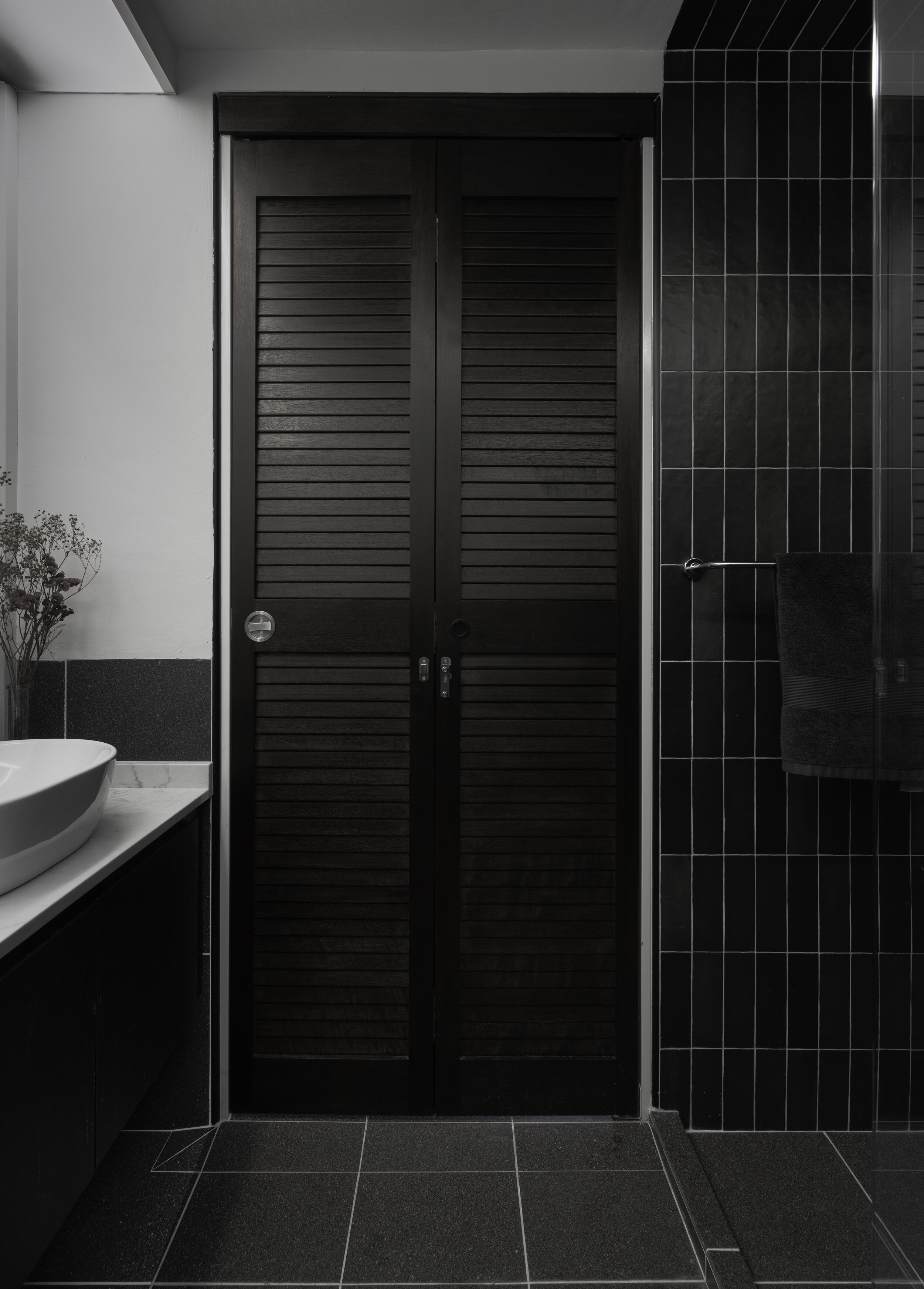
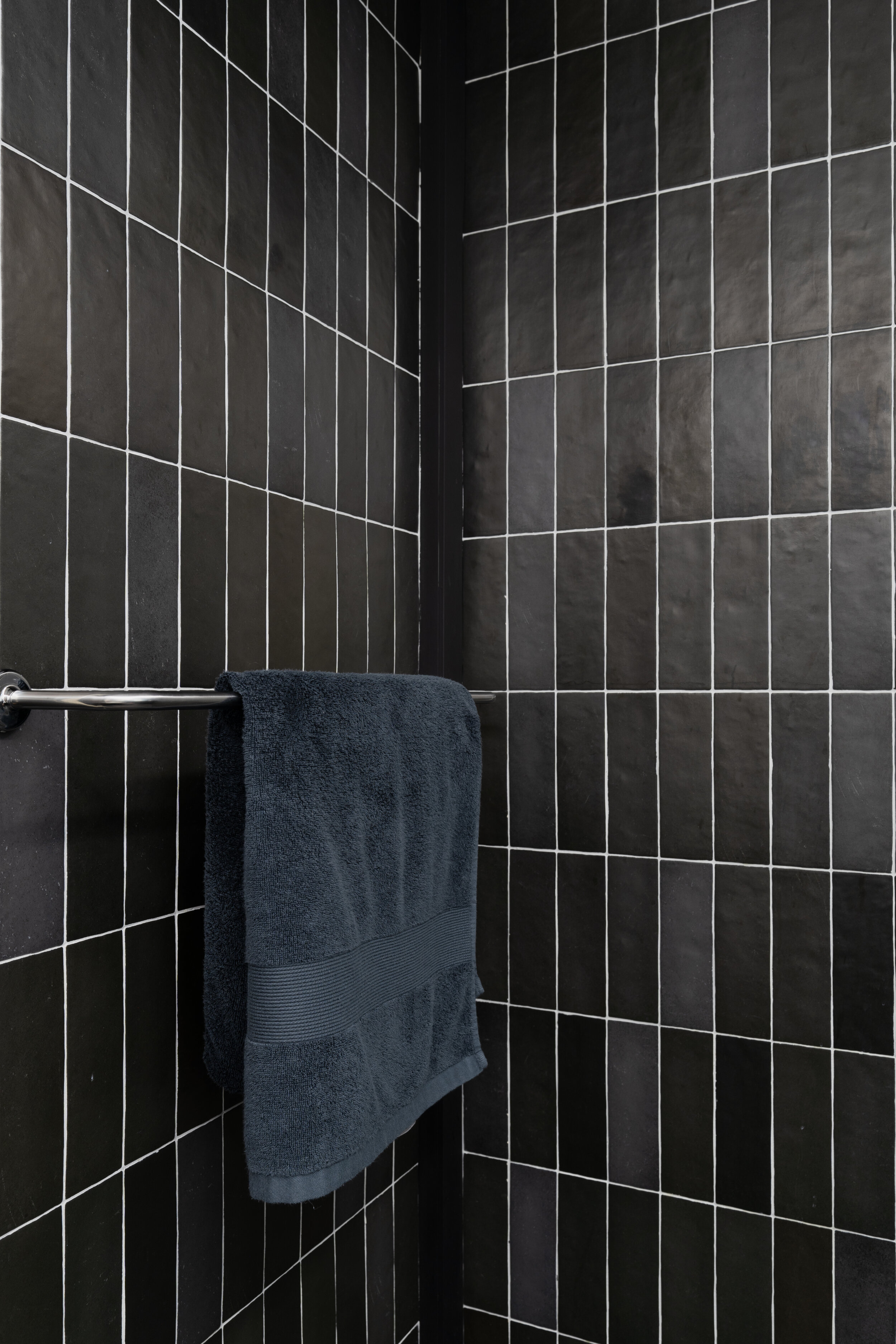
The master bath followed a monochrome palette, with louvered doors for ventilation while maintaining privacy. This strikingly dark space is a great way to switch off a busy mind, with the bathroom acting as a transition from a long day out to a comfy night in.

