Interiors for 2021, and beyond.
Our designer Hui Ling’s dream home render
Interiors for 2021, and beyond.
One quarter has flown by this year. I will be attempting to pen down what we (BuildBuilt’s designers) think about interiors so far, for 2021.
As interior designers, we are bombarded by questions from clients on a daily basis. From ‘how does laminate compare to wood veneers?’, or ‘what is quartz?’, or ‘how much would a minimalist interior design cost?’. 🤷🏻♂️
And if we’re lucky enough, we do receive clients who would allow us to work on an empty canvas. Homeowners do ask us now and then, what we think are the ‘latest’ ‘trendiest’ but most ‘timeless’ designs for interiors.
Earlier this year, we had an internal workshop amongst the BuildBuilt designers, and we had the honour of Kelly Wearstler (virtually) telling us what’s what in her Masterclass. After the program, we had a round-table discussion on what we think about interior design trends, and the aesthetic landscape of 2021.
2 camps.
Kaixuan (aka. Keira) drew 2 separate camps to explain her theory:
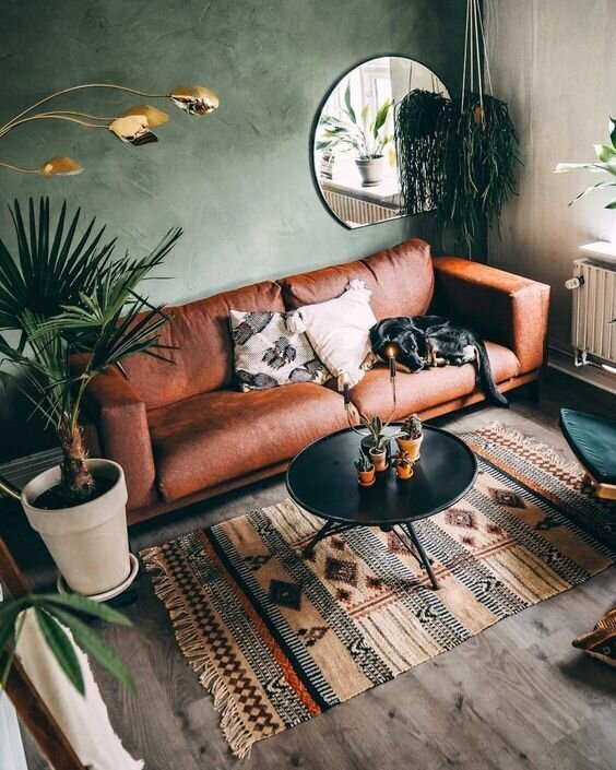
Camp no. 1 shelters people who hold bolder colour and textures in higher regard.
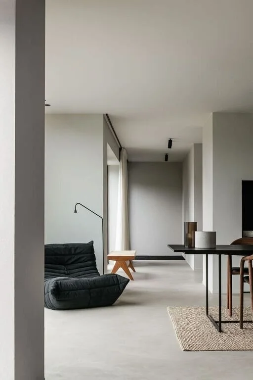
Camp no. 2 would see the clean and minimalist congregation.
Designers will be required to understand these 2 camp grounds well and perhaps at time, unite the seemingly contradicting characteristics that define each camp.
Camp 1
House by fiefroeling
Camp 2
Begian Farmhouse by Pieter Vanrenterghem
Times are a’changing
In 2020, Nadia had an epiphany that home owners have accepted that home is going to be the only constant for awhile (since Covid-19). 2021 will not be that different. Home owners have been requesting for the most comfortable look, that reminds them of a far-away holiday. Within this resort, dwellers will also have to work, learn and play. Aside from being smart about mashing more functions within a single space, the crowd-favourite aesthetic of this home resort seemed to narrow in on, not balinese resorts, not Australian beach houses, nor the meditative oriental get-aways... but the Scandinavian log cabins.
Young St House by Tom Mark Henry. Photo by Damian Bennett
Nature.
If I counted the number of words repeated, the sound-byte bank would fill itself with words like: natural, organic, neutral, plants, textured, landscape…
Aside from materials holding these characteristics, Farrah thought that forms could also have a much softer look if we break away from linear design. Curves and dissolved edges break out the rigid interiors to form cosier, inviting interiors for the home. Furniture could also represent elements within nature. Imagine stools and ottomans dotting the living room like stones and pebbles scattered lazily across a garden.
Scattered, soft furniture
Pale by Bronxes Studio
Go big, or go.. home?
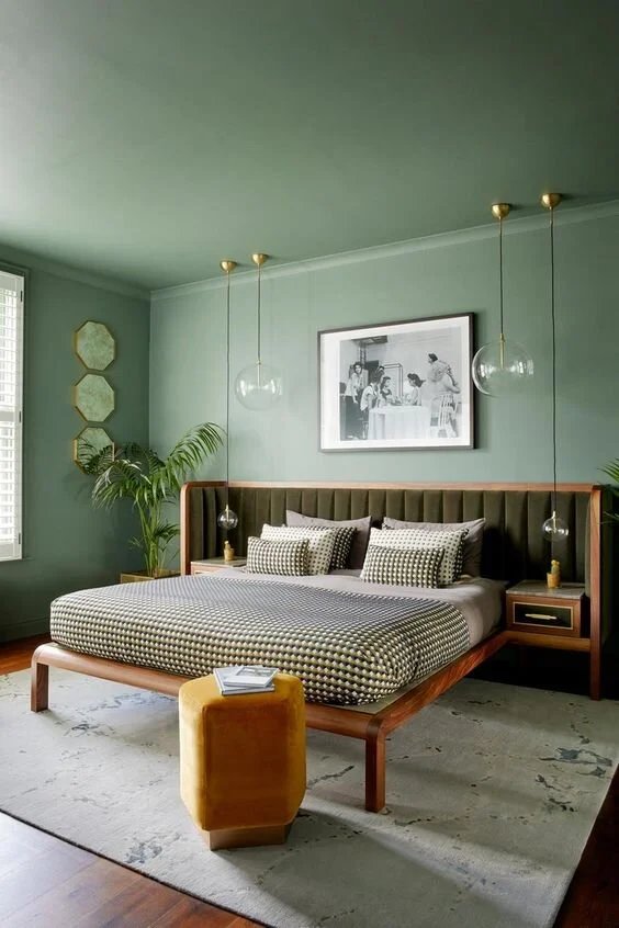
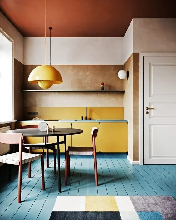
As interior designers for homes, we love applying dual tone colours throughout walls in homes as a safer option to excite spaces. They match easily with seasonal accessories, furniture and art pieces. To err on the safe side, we tend to select a singular wall to paint to highlight this space as a feature. However, we think that a bolder new look has arrived. We have been exploring to paint multiple faces consistently to create a stronger statement across the space. Aside from splashing paints on walls, wall coverings does a great job in telling stories too. We love picking out dead spaces to apply wall coverings on. Draw the eye to a seemingly ‘stale’ wall. Your wall covering will last longer since no one walks into dead spaces. The chances of scuffing should decrease.
Even the ceiling’s green!
House of Joao Botelho. Photo by Paul Raeside.
Material blocking.
Colour blocking was a good idea to create interest in spaces, but could come off as tacky. Zack has been exploring a similar idea, but through material blocking. He picks out natural materials that speak brighter and bolder colours, and will put them side by side for a contrasting effect - either to demarcate zones, or to give items within the area a sense of belonging.
Colour Blocking
Extraordinary Apartment by Yaroslav Priadka
Material Blocking
28 MLC by A.R.Rivani Architecture
Viv’s wabi-sabi wonderland
Imperfect curation.
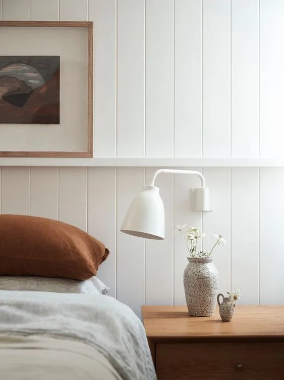
Singapore is known for its immaculate and pristine environment. Think the manicured bougainvillea shrubs along the East Coast, the bonsai looking tembusus at the Botanical Gardens. It’s no-wonder that Singaporeans love straight lines. A tidy and neat interior is lovely to look at, but hard to maintain! How about Viv’s wabi-sabi recommendations for a laid-back, Japanese influenced interior (see picture attached, ‘nuff said)
Whatever the ‘trend’ maybe, BuildBuilt has created a human-first process that will blend user preferences with our designer’s style. The approach to optimising space with on-form aesthetics is through a great relationship between designer/builder and home dweller. This trend will never expire.


